The Gato identity
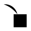
A crystal radio finds a faint station with one fine wire touching a crystal. The mark is that moment of contact, the voice is wide panel lettering, and the colour is a tuning-eye green that no early-stage peer uses.
Guidelines (PDF)Lockup (SVG)Symbol (SVG)Tokens (CSS)Dial drawing

Logo
- Clear space: one cap height of the wordmark on every side. Minimum size: 20 px tall on screen, 7 mm in print.
- Never lift the whisker off the crystal: the contact is the idea.
- Never turn the crystal into a diamond: it reads as a kite.
- Never recolour the whisker outside Tuning Green, white or ink.
Colour
- Dial White#eef5f1Page ground
- Tuning Green#1f9488Brand colour: the whisker, active tuning
- Tuning Green 700#097a70Fills behind white text (5.3:1)
- Band#0b6f66The dial band and closing fields
- Ink#111f1dType and the crystal
- On-Air Red#d7261eOne point per view: the live lamp
Type
Saira, set wide
Display. Width 112 to 125, weight 500 to 600, like lettering engraved on a radio panel. Capitals only for dial labels.
Radio Canada, for reading. A broadcaster’s own typeface, set at 17 px with a 1.6 line height.
Text. Weights 400 and 600, tabular figures for frequencies. Both families are OFL and self-hosted.
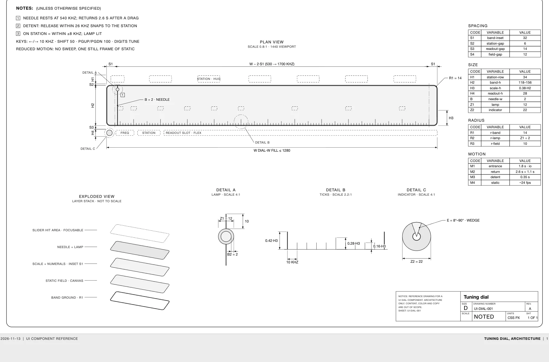
The tuning dial, drawn
The signature component as an engineering sheet: every dimension is a variable, every value comes from the built code.